
INTRODUCTION
In this post, I will examine the design principles applied to the original Palmolive shampoo & conditioner ad campaign and the new version of the ad I created to determine why the design is good. You can find the original ad here: https://images.app.goo.gl/5pDe1NDrUeCWP8PBA.
Since I couldn’t find any information on the designer of the original ad shown above, I decided to do research about Palmolive.
According to my research, “Palmolive is an American multinational brand of a line of products produced by Colgate-Palmolive. The Palmolive brand grew from one product, Palmolive bar soap. Made of coconut, palm, and olive oils, Palmolive bar soap was introduced in 1898. Originally, the bar soap floated like Proctor & Gamble’s Ivory bar soap. By the turn of the 20th century, Palmolive bar soap was the world’s best-selling soap. Current Palmolive brand products include dishwashing liquid as well as personal care products such as shampoo, hair conditioner, body wash, bar soap, and liquid hand-wash.”(https://en.wikipedia.org/wiki/Palmolive_(brand).
As I mentioned above, this Reverse Engineer Post aims to analyze the design of the original and the new Palmolive shampoo & conditioner ad campaign and why it’s effective. So, let’s begin!
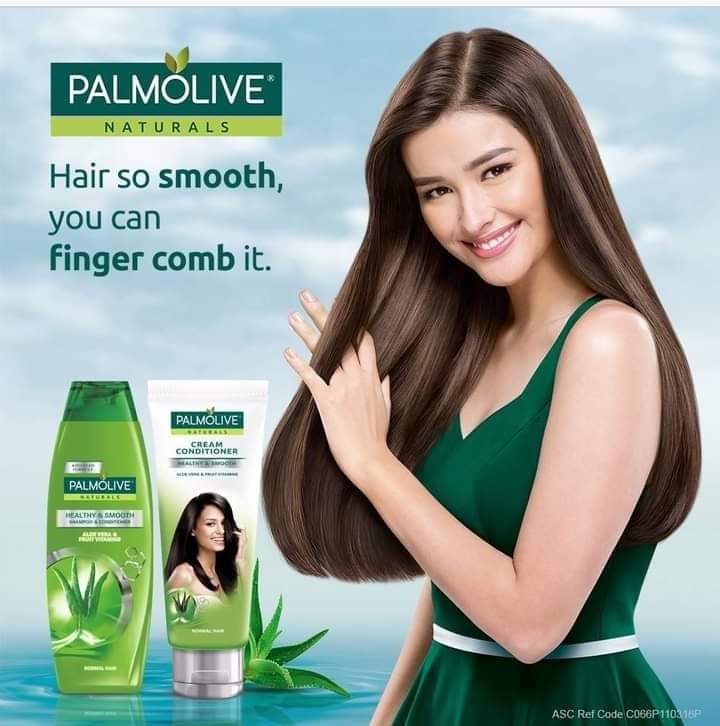
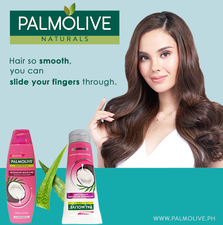
ORIGINAL AD ANALYSIS

Design
Contrast

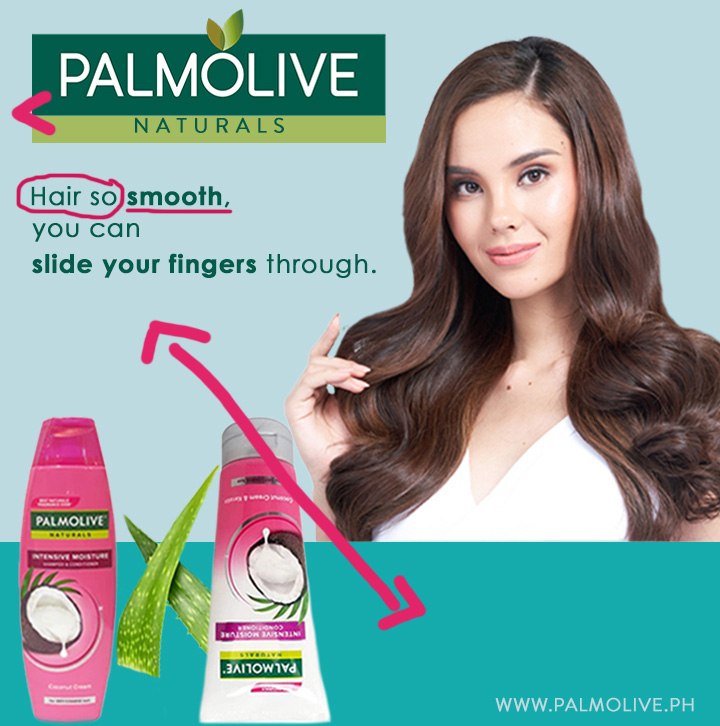
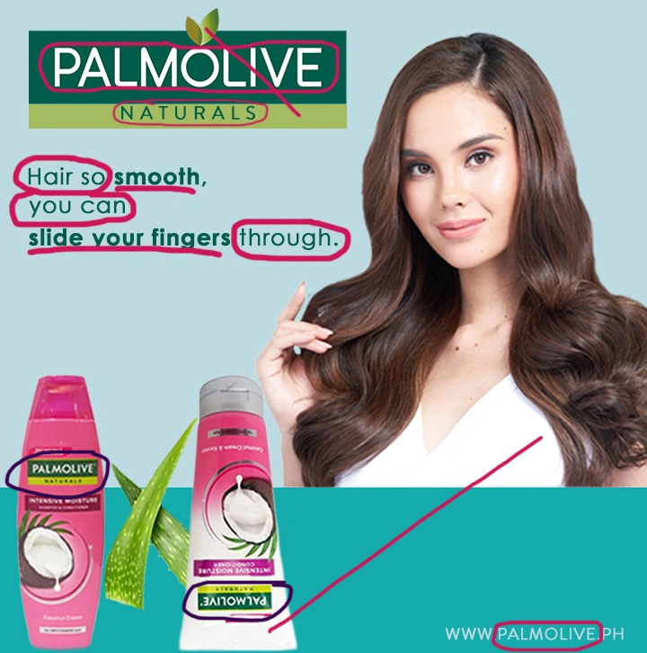
The designer applied good contrast to this design. For example, yellow-green and dark green contrast with each other. The background’s light blue and dark blue also show good contrast, and the text’s structure: regular font contrasts with some of the bold font – highlighting why the product is good. Lastly, the image of the product and the endorser is darker enough, contrasting with the lighter background color.
Repetition
The design’s visual elements, such as colors, textures, the Palmolive logo, and the aloe vera images, are repeated, as well as the text’s structure: bold and regular fonts. The designer did a great job utilizing this design principle; this helped the ad campaign look organized and unified!
Alignment
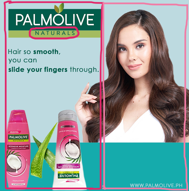
When we look at the design, we can easily see that two alignments are applied to this design – the left and right, except the “N A T U R A L S” in the textbox under the logo because the designer used center alignment on this one. With the left and right alignments, the designer made it easier for the readers’ eyes to look at the ad, and it looked clean too.
Proximity
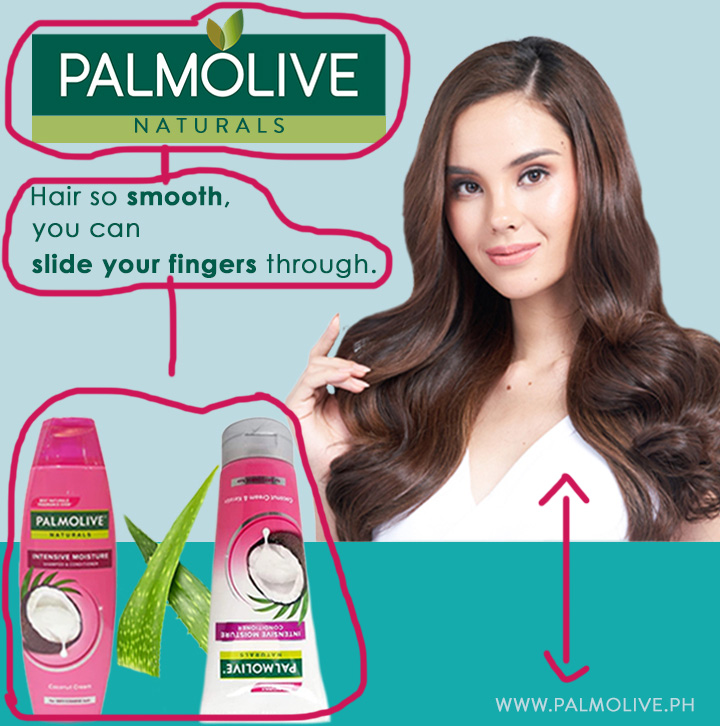
The designer did a great job applying the proximity principle to the design. For example, related items such as the Palmolive logo and the “N A T U R A L S” textbox are grouped together, making it look like they are one because they have a connection, like letting the customers know that Palmolive used “natural” ingredients for their products. Likewise, the text/wording is closer to the logo because they connect. Lastly, the shampoo, conditioner, and aloe vera are grouped together because they are related, and the endorser is closer to the product she’s endorsing.
Color

I like the color scheme used in this design. It shows patterns and connections between different visual elements on the page. For example, yellow-green and dark green are the Palmolive theme colors in this advertisement because of the products’ colors. Dark green gives strong contrast and compliments well with the other colors used in this design. The designer did a great job deciding what color scheme to use in this ad campaign because it’s appealing to the eyes.
Typography

I am unsure what the name of the typeface used in the text/wording here is, but I am confident that the typeface used in the design belongs to the sans-serif type category. I think the designer picked a suitable typeface for the ad because it’s readable, and that’s what matters, and there’s only one type of category used in the design anyway, so it’s good – no conflict.
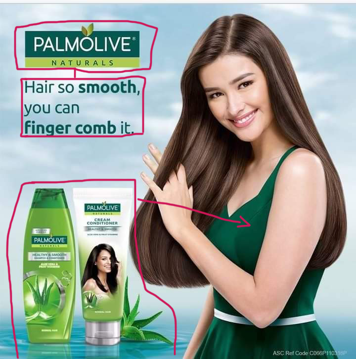
NEW AD ANALYSIS

Design
Contrast
Like the original ad, yellow-green and dark green contrast with each other. In fact, green gives strong contrast here. The background’s light blue and dark blue also show good contrast, and the text’s structure: regular font contrasts with some bold font to highlight important details like the product’s effectiveness on the hair.
Repetition
Like the original ad, the design’s visual elements, such as colors, textures, and the Palmolive logo, are repeated, as well as the text’s structure: bold and regular fonts. Repeating some elements is good as it shows unity with other elements on the page and consistency.
Alignment
Since I was imitating the original ad, I used the exact alignments in my design. Therefore, the model for the product is right-aligned, and the logo, text/wording, and the product are left-aligned except for the “N A T U R A L S” in the textbox that used center alignment like in the original design. I think it looks good because the alignments give the eyes one direction.
Proximity
There is good proximity applied here. For example, like in the original ad, I grouped the related items such as the “N A T U R A L S” textbox and logo. Likewise, shampoo, conditioner, and aloe vera are also grouped because they are related. The text/wording is placed closer to the logo because they connect, and the model is also placed closer to the products she is endorsing. The Palmolive website address is placed far because it doesn’t connect to the other visual items.
Color

I used the same color scheme used in the original ad. The lighter blue and the darker blue complement each other very well; they also complement well with the different colors used in the design. The colors are not showing conflict with each other, which is excellent.
Typography

The typeface I used in the text/wording here is Century Gothic, which belongs to the sans-serif type category to mimic the original typeface. Like the original ad, this typeface is suitable for this advertisement because it’s easy to read. In addition, there is no other typeface used from a different type category. Therefore, I don’t have to worry about typefaces conflicting.
CONCLUSION
Indeed, the original and new ad designs are almost the same, so they work together for the same campaign. Above all, the original and the new ad utilized the basic design principles well, from the contrast to repetition, alignment, proximity, color, and typography.


Leave a comment